
A/B Testing App Store Screenshots: What I Learned From 12 Failed Variants
12 App Store screenshot variants that lost — and the App Store product page optimization lessons they taught me. What to test first, how long to run, and how many variants.
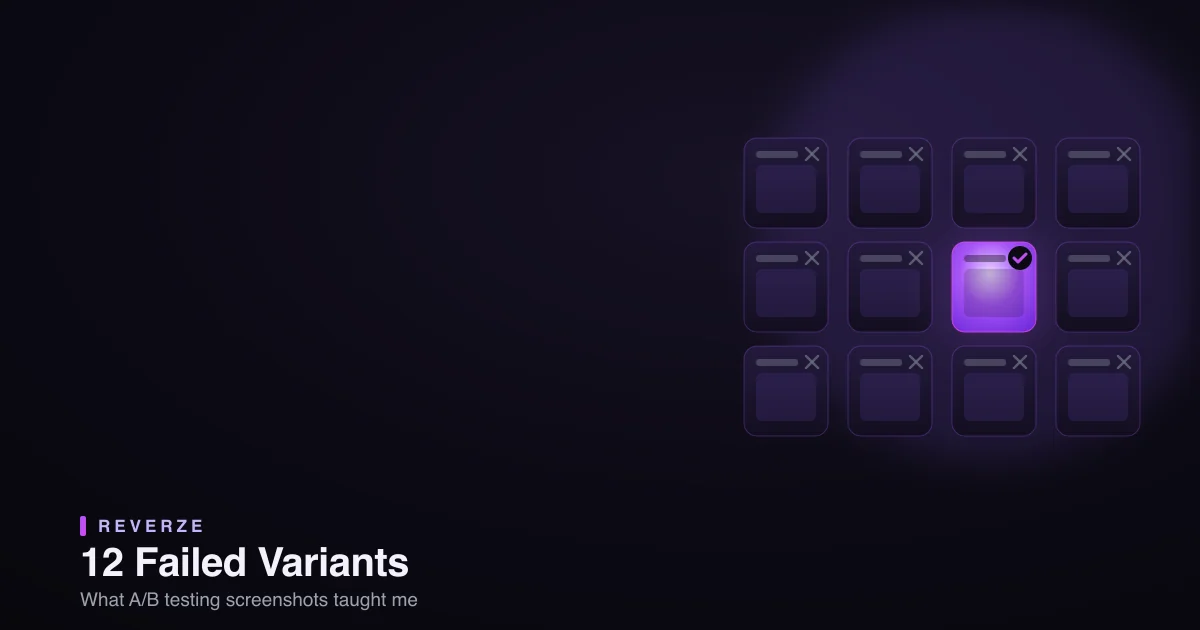
I ran a lot of A/B tests on my App Store screenshots before I ran a good one. Twelve variants lost — some to my baseline, some to statistical noise, a couple to my own ego. And honestly, the losers taught me more than any "10 tips for higher conversion" post ever did. So here's the failure-led version: the 12 things that didn't work, and the App Store product page optimization lessons hiding inside each one.
Quick context: what "A/B testing screenshots" actually means
On the App Store, this runs through Product Page Optimization (PPO) in App Store Connect — Apple's built-in tool that lets you test up to three treatment variants of your screenshots (and icon) against your live baseline, splitting real traffic and reporting which converts best. It's free, it's first-party, and it's the only honest way to know what works instead of guessing. Everything below happened inside it.
The 12 failures, grouped into the lessons that actually stuck
I'll spare you all twelve one by one — they cluster into six mistakes, and you'll recognize them.
1–2. I changed everything at once. My first two "tests" swapped the layout, the colors, and the captions in one variant. It lost — and I had no idea why, because I'd changed six things. Lesson: test one variable at a time, or you're not testing, you're just redesigning and hoping.
3–4. I tested changes too small to matter. Then I overcorrected: a slightly different shade of purple, a caption reworded by three words. No variant moved because nothing meaningfully changed. Lesson: A/B testing rewards big, legible swings — a different first-frame message, not a different font weight. Small taste-tweaks are invisible to real users.
5–6. I changed the wrong screenshot. I lovingly optimized screenshots four and five — the ones nobody scrolls to. Lesson: the first 1–3 frames do almost all the converting. Test those. Optimizing frame five is rearranging deck chairs. (I went deep on which frames matter in why your screenshots are costing you downloads.)
7–8. I called it too early. Two variants were "winning" after three days, so I shipped them. Both were noise — the lead evaporated with more traffic. Lesson: run until you have real significance and enough installs, usually a couple of weeks minimum, not a hopeful weekend. Early results lie.
9–10. I tested my taste, not the user's. My favorite variant — the one I thought looked coolest — lost to an uglier, clearer one, twice. Lesson: the point of testing is precisely that your taste is a hypothesis, not a verdict. Let the numbers overrule you. That's the whole reason to test instead of just designing.
11–12. I ignored that localization skews it. I ran a test on a listing that was half-localized, and the non-English traffic muddied the result. Lesson: test within a consistent audience, and remember a variant can win in one market and lose in another.
So what actually won?
After the twelve losers, the pattern behind the winners was almost boring:
- Big swings on the first frame. The variants that moved the needle changed the promise in screenshot one, not the polish.
- One variable, clearly. Isolate the change so the result means something.
- Run it long enough to trust the number.
- Message over craft. Clarity beat prettiness nearly every time — the same thing the winning listings do.
None of that is clever. It's just discipline, which is exactly what my twelve failures lacked.
The real bottleneck wasn't ideas — it was making the variants
Here's the practical thing nobody warns you about: A/B testing dies not from a lack of ideas but from the effort of producing each variant. Building three distinct treatments — each at every device size — by hand, for every test, is so much work that most people run one lazy test and quit. That's why I stopped hand-building them.
I generate my test variants with Reverze's batch generation — I describe the directions I want to try (a benefit-led first frame, a proof-led one, a bolder background), and it produces the full sets, every size, ready to drop into PPO as treatments. When making a variant costs minutes instead of an afternoon, you actually run enough tests to learn something — which is the entire game.
If you're starting your first test
Don't repeat my twelve. Pick your first screenshot. Write one genuinely different promise for it. Generate that as a single-variable treatment, run it in PPO against your baseline for a couple of weeks, and let the number — not your taste — decide. Then do it again. That's the whole loop, and it works precisely because it's disciplined and boring.
The twelve failures weren't wasted. They were tuition. Skip the tuition: test the first frame, one big change, long enough, and let the data win.
Reverze is the AI-native studio for App Store creative — generate A/B test variants in batches, every size, ready for Product Page Optimization. Start in the app or explore the free tools.